A Task First Approach to Manager Support
UCSF employs more than 15,000 people across its health system and campus. This project focused on the experience of people in manager roles who rely on the HR site to hire, onboard, and support their teams.
A research-driven redesign of content, information architecture (IA), and manager-facing workflows
TL:DR
Managers reported difficulty locating HR information, understanding responsibilities, and navigating multiple disconnected systems. I led a multi-phase UX initiative to uncover these pain points, redefine the Manager experience, and create a task-first information architecture that aligns with how managers actually work. The result is a clearer, more intuitive, and more reliable HR website experience built on structured research, stakeholder collaboration, and evidence-based IA design.
Project Snapshot
Role: Lead UX Designer
Timeline: Oct 2024 – Apr 2025
Team: HR Leadership, UX, PeopleConnect, Enterprise Managers
Skills: UX Research, IA Design, Content Strategy, Stakeholder Facilitation, Prototyping, UX Writing
Deliverables
- Multi-phase research plan
- Interview findings report
- Manager survey and analysis
- Whiteboard IA workshop (Figma) with HR partners
- Content model and redesigned IA for Manager Landing Page
- Prototype direction and testing roadmap
Background & Problem
Managers across UCSF struggled to complete HR tasks because information was scattered across UCPath, PeopleConnect, HR Umbrella, and department sites. Search results were irrelevant, navigation was misaligned with real workflows, and manager-specific content was incomplete or missing.
This caused:
- Heavy reliance on colleagues instead of HR resources
- Loss of trust in HR website accuracy
- Confusion between HR vs. department responsibilities
- Difficulty completing essential tasks like hiring, performance, and leaves
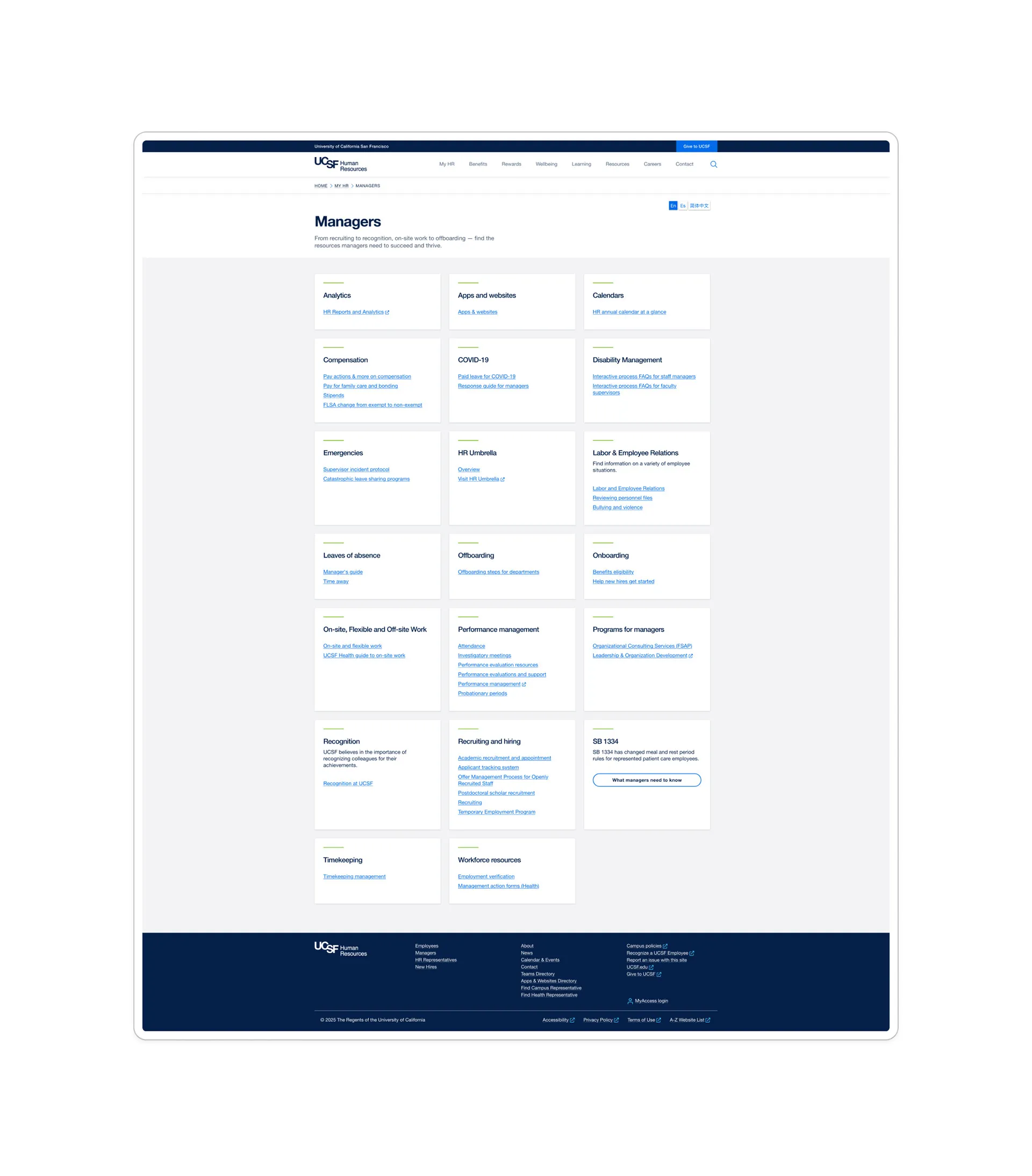
Before look of the Manager Landing Page.
Research Approach
Phase 1 – Qualitative Interviews
18 participants: HR leadership, partners (support staff), and enterprise managers.
Methods included semi-structured interviews, navigation tasks, and whiteboarding to understand tasks and workflows.
Key discoveries:
- Search produced irrelevant results
- Manager-facing content was inconsistent
- Systems were confusing and poorly differentiated
- Many managers did not know the HR website had recently improved
Phase 2 – Quantitative Survey (111 responses)
Validated the core themes and revealed the highest-priority needs.
Key findings:
- Top priorities: hiring processes, policies, contacts
- Most challenging tasks: leaves, navigating policies, HR systems
- Most desired improvements: search, clearer navigation, role-based filtering
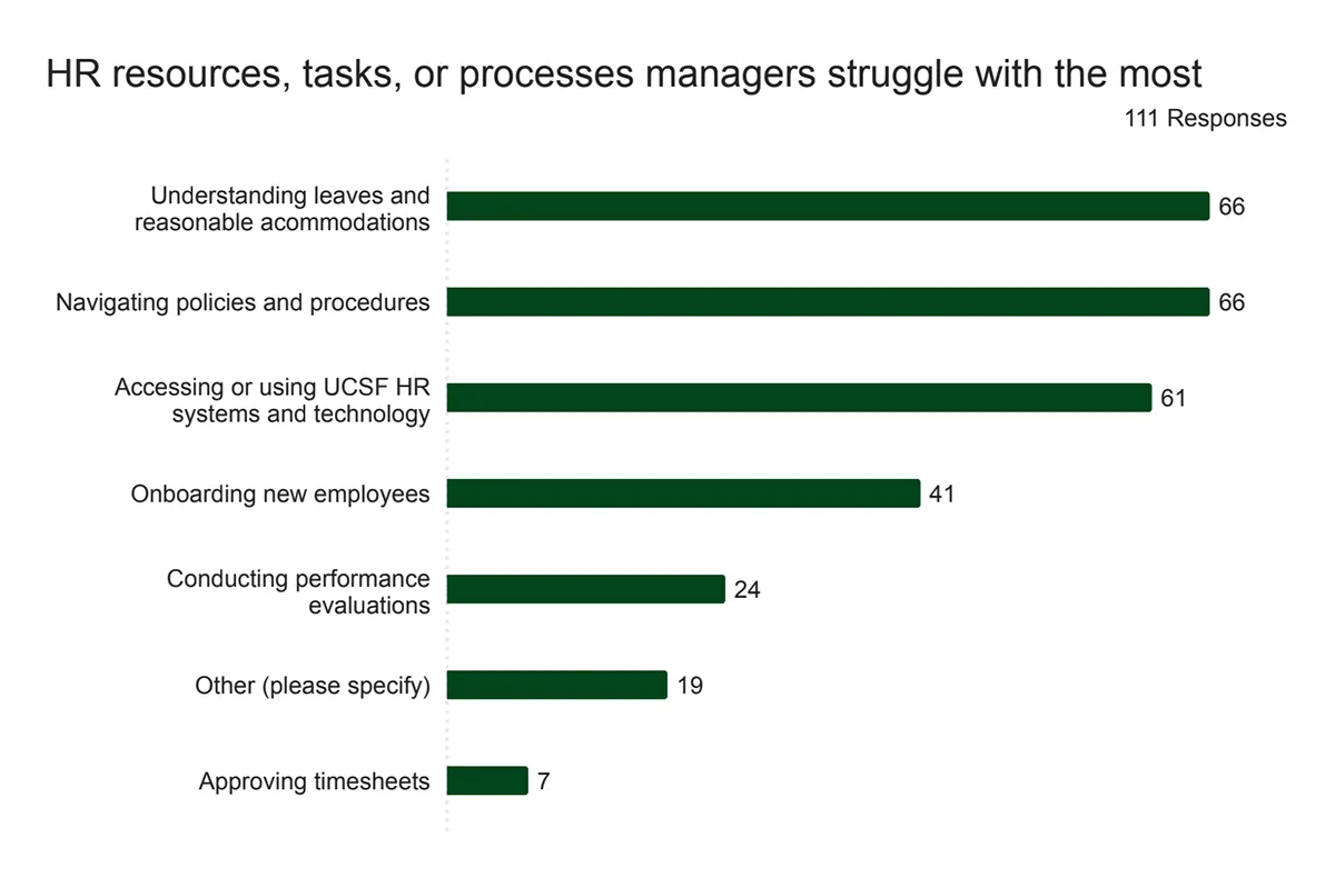
Everything uncovered in interviews showed up again quantitatively in the manager survey.
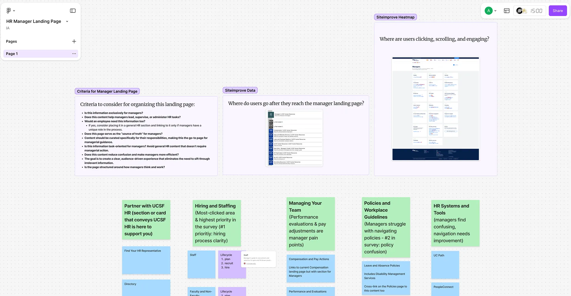
Phase 3 – Information Architecture Workshop
I facilitated a Figma-based workshop with HR teams to define the structure of a future Manager-specific landing page.
We aligned on:
- A task-first IA
- Content governance for long-term consistency
- A lifecycle model for hiring and staffing
- Clear distinctions between tasks, systems, and policies
Phase 4 – Usability Testing
Validate IA and design decisions.
(Phase 4 was paused by HR due to budget shifts; I provided a testing plan, moderation guidance, and task scenarios for HR to use later.)
Insights + Opportunities
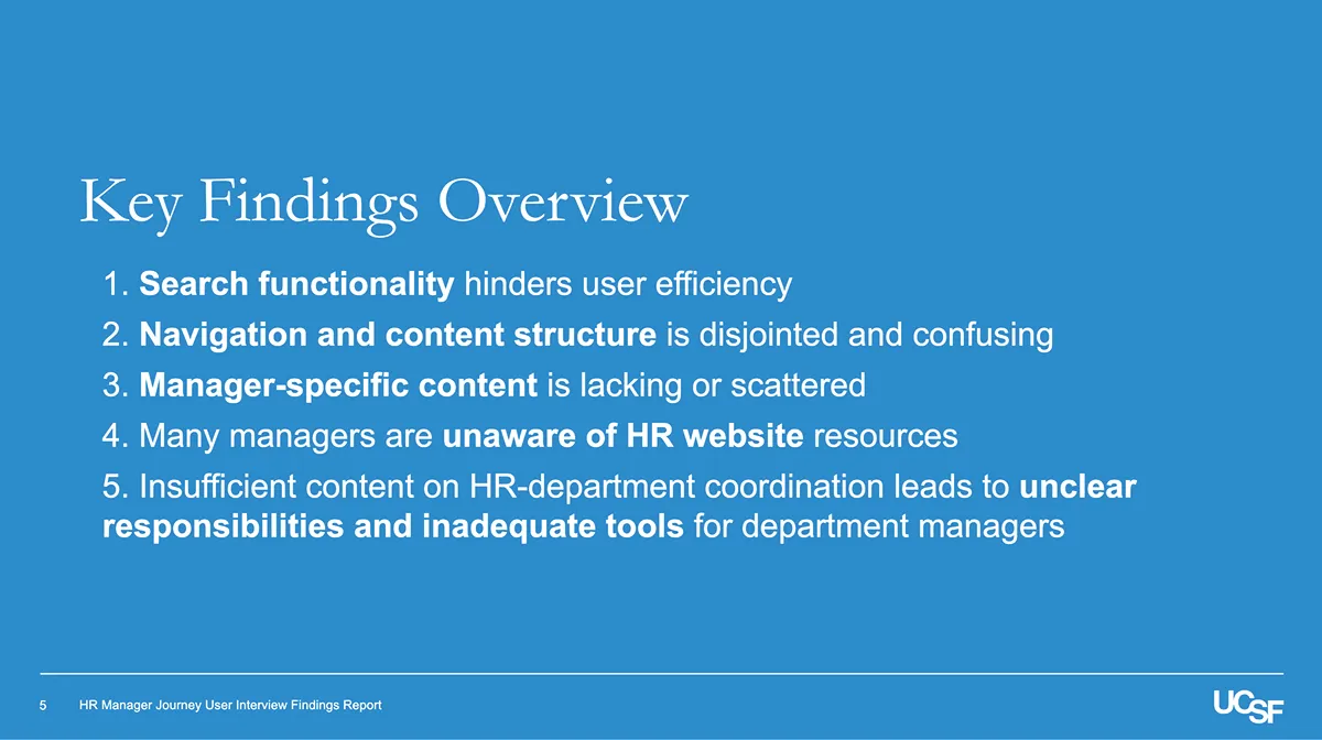
Across phases, five critical insights emerged:
-
Search fails managers when they need it most.
Irrelevant search results and poor filtering forced managers to rely on Google or colleagues. -
Navigation does not reflect how managers think.
Content was buried, mislabeled, or spread across systems. -
Manager-specific content was missing.
Managers were creating their own department-specific guides due to unclear or incomplete documentation. -
Awareness and trust were low.
Many managers did not know where authoritative content lived. -
System fragmentation created cognitive overload.
Managers had no clear mental model of UCPath, PeopleConnect, HR Umbrella, BrassRing, etc.
Five Strategic Opportunities
- Improve search through better metadata and HR-relevant filters.
- Rebuild navigation around task frequency (Often, Sometimes, Rarely).
- Create a reusable content model for manager tasks.
- Establish a role-based utility menu and clarify system purposes.
- Strengthen adoption through communications and cross-linking.
IA Workshop
Using the findings, I led a collaborative workshop to determine what belonged on the Manager page and how to structure it.
Diagnostic questions included:
- Is this exclusively for managers?
- Does it help managers complete a task?
- Would an employee need this?
- Does this reduce confusion?
- Is the Manager page the source of truth?
Workshop outcomes:
- A consensus task-first IA
- Clarity on what to surface vs. cross-link
- A lifecycle model: hiring → onboarding → performance → offboarding
- A simple framework for explaining systems
- A governance model for future updates
 Screenshot of FigJam workshop
The Redesigned Manager Landing Page
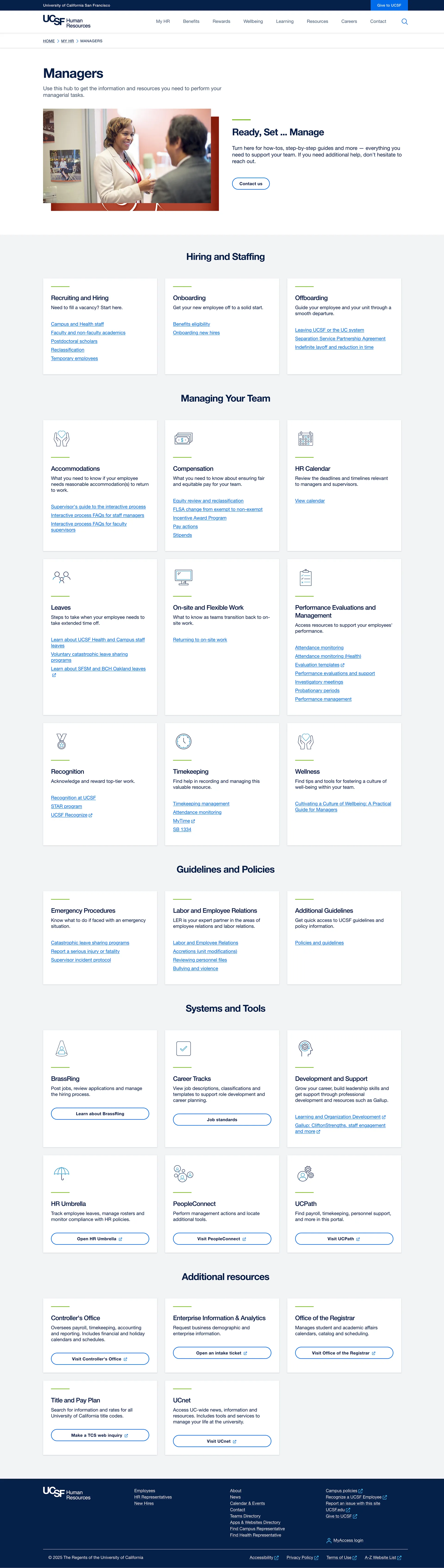
Screenshot of new layout for the Manager Landing Page
The new design organizes content the way managers actually work:
Hiring & Staffing
Structured around lifecycle stages.
Managing Your Team
Consolidates day-to-day responsibilities: Accommodations, Compensation, Performance, Leaves, Timekeeping, Recognition, Wellness.
Policies & Guidelines
Unified location for emergency procedures, labor relations, workplace rules, and more.
Systems & Tools
Clear expectations of what each HR system does.
Additional Resources
Lower-frequency content like Controller’s Office and Title & Pay Plan.
Real-World Constraints & Hand-off
Budget constraints: HR paused usability testing (Phase 4). I created a full testing plan so HR could continue independently.
Design system limits: Visual design was constrained by UCSF’s system, so impact focused on structure, clarity, and content.
Distributed content ownership: Multiple HR teams owned content; I created templates and structured models to support consistency.
Despite these constraints, the work delivered a strong foundation for long-term improvement.
Impact
Throughout this project, I:
- Led end-to-end research and analysis
- Converted insights into a structured, scalable IA
- Facilitated alignment across complex stakeholder groups
- Built frameworks HR can use long term
- Established a content model that simplifies workflow understanding
- Created a roadmap the team can continue without dependency on me
Analytics Results
I used Q3 2024 to Q3 2025 as a comparison because both periods represent stable usage outside the redesign and testing cycle. This avoids inflated internal traffic and provides a realistic view of how managers use the page.
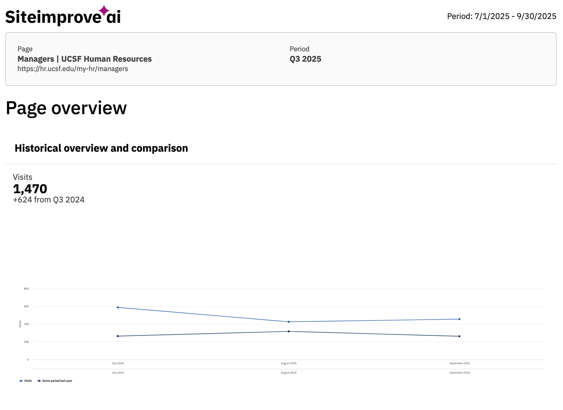
Visits increased 74% (846 → 1470)
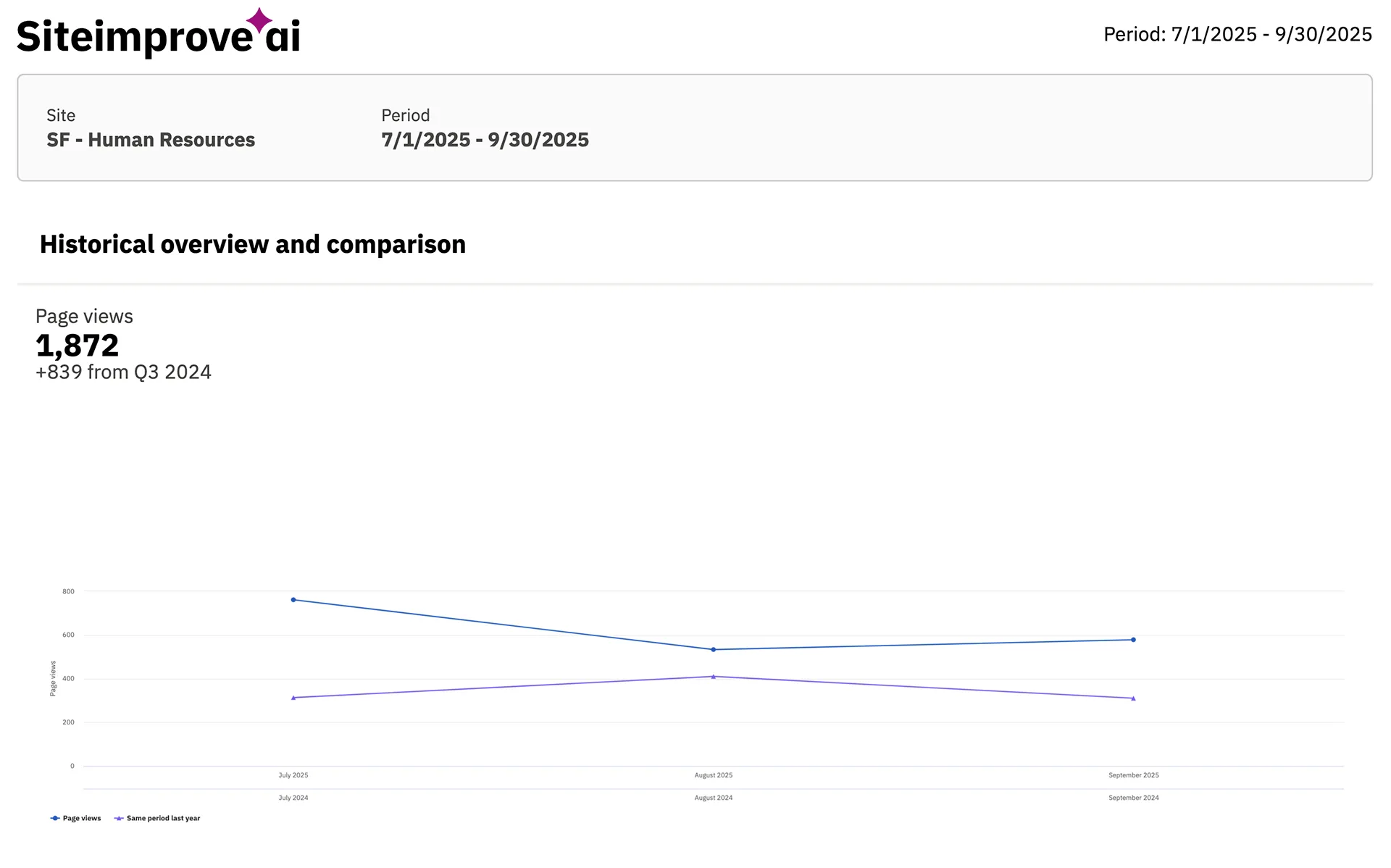
Pageviews increased 81% (1033 → 1872)
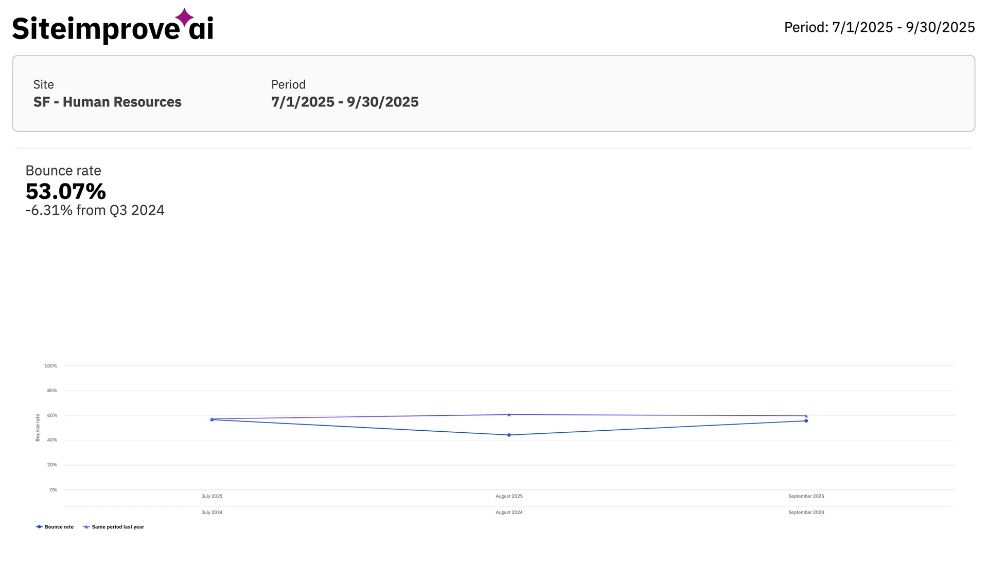
Bounce rate improved from 59% to 53% (down 6 points)
Additional impact
- Direct first-time visits doubled from 9% to 19%.
- Downstream navigation shifted from broad HR pages to manager-specific tools:
Recruiting Resources, Equity Review, New Hires Manager Guide.
These changes show that managers are finding the page more easily, choosing the right tools faster, and moving through tasks with greater clarity.
Conclusion
This project showcases my ability to bring order to complexity, lead enterprise-level research, and shape strategic, scalable information structures grounded in real needs. With the right research, collaboration, and content strategy, even heavily siloed environments can support a more intuitive and dependable experience for managers.