URL Sitemaps vs Visual Sitemaps: What They Are and When to Use Them
A clear guide to the difference between URL sitemaps and visual sitemaps, when to use each, and why both matter in information architecture.

TL:DR
A URL sitemap is the Hoarders house: overstuffed rooms, forgotten boxes, mystery piles, and content no one wants to claim. A visual sitemap is the Marie Kondo version of the same space: intentional, organized, and shaped around what users actually need. You need both to understand what you have and what you want the experience to be.
What a URL sitemap actually is
In UX and IA, “sitemap” gets used casually, as if it describes a single artifact. In reality, there are two very different maps with very different jobs. The first is the URL sitemap.
A URL sitemap is the full inventory of everything that exists in a site’s structure. It’s the behind-the-scenes footage: nothing curated, nothing filtered, nothing hidden. It shows the site exactly as it is, not as anyone wishes it looked.
And it can be a lot.
https://company.com/
https://company.com/products
https://company.com/products/analytics-suite
https://company.com/products/analytics-suite/pricing-current
https://company.com/products/analytics-suite/faq
https://company.com/products/analytics-suite/faq-old
https://company.com/products/analytics-suite/faq-v2
https://company.com/products/analytics-suite/archive/2019
https://company.com/resources
https://company.com/resources/case-studies
https://company.com/resources/case-studies/healthcare
https://company.com/resources/case-studies/healthcare-2018
https://company.com/resources/case-studies/finance
https://company.com/resources/case-studies/finance-temp
https://company.com/blog
https://company.com/blog/2024/optimizing-workflows-delete-this
https://company.com/blog/2024/ui-patterns-guide
https://company.com/blog/2020/product-launch-draft
https://company.com/legal/privacy2
https://company.com/legal/terms
https://company.com/system/internal/audit-logs
https://company.com/system/internal/audit-logs-backup
https://company.com/system/internal/data-export
https://company.com/system/internal/data-export-old
What a URL Sitemap Helps You Discover
- Forgotten pages from six site admins ago
- Deep, winding paths no user would ever find
- Duplicate content created over years of patchwork publishing
- Legacy slugs that confuse both humans and crawlers
- Content sprawl that tells the real story of governance
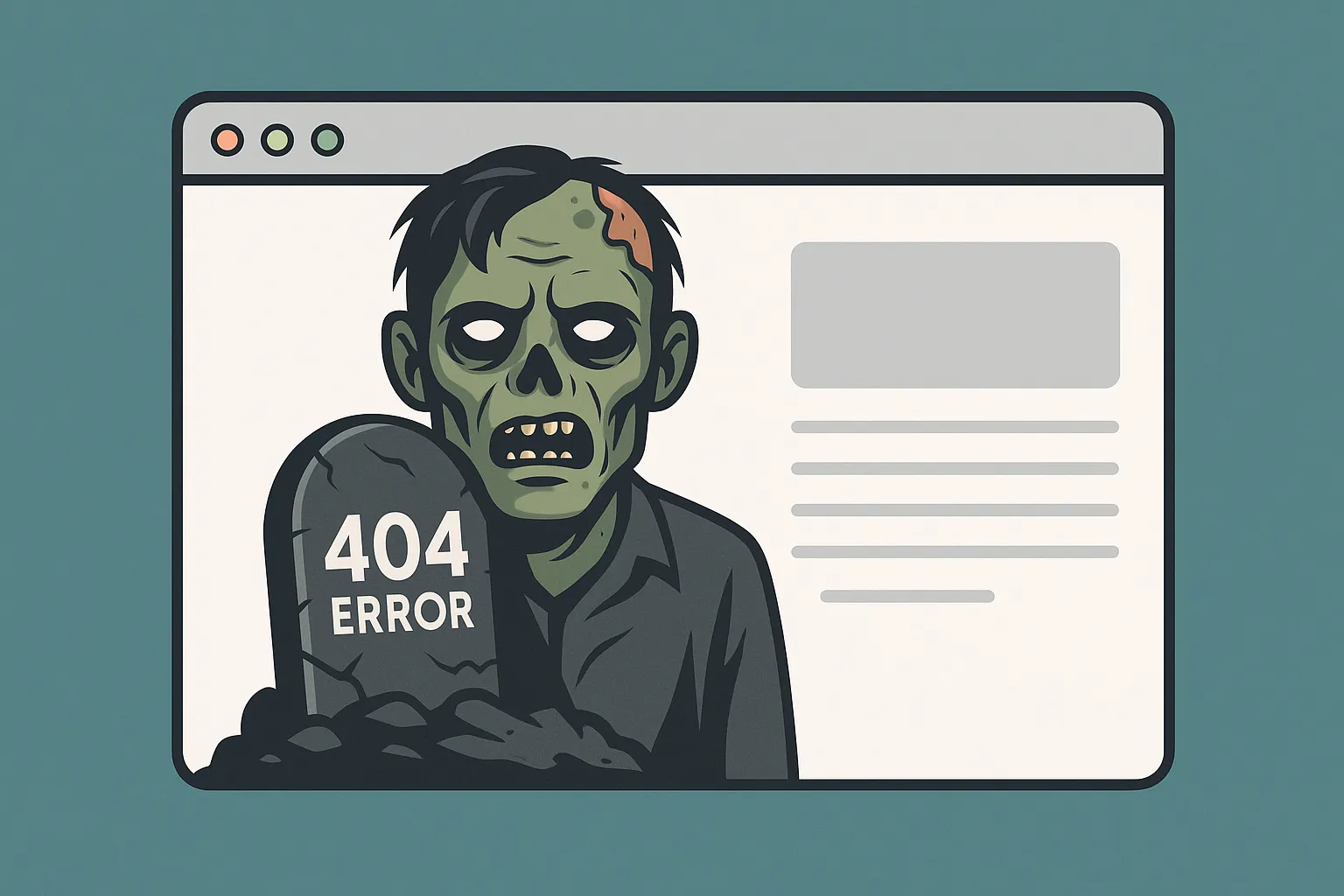
- Zombie pages that continue to rank long after their purpose is gone
In higher ed and enterprise environments, this gets even more interesting. Entire sections of a site may live behind:
- role-based permissions
- buried admin tools
- microsites built long before current standards
- legacy content no one feels empowered to retire
These pages never appear in a visual sitemap, yet they still affect technical debt, indexing, governance, and user trust. In many ways, a URL sitemap is the most honest mirror of an organization. When the structure is chaotic, the workflows behind it usually are too.
When You Use It
Always at the beginning. URL sitemaps ground audits, migrations, redesigns, and redirect planning. They show the landscape you inherited before you shape the one users will experience.
Why It Matters

Information architecture writers like Peter Morville, Louis Rosenfeld, Abby Covert, and Jorge Arango share a core belief:
Structure shapes meaning.
Modern search engines rely heavily on semantic relationships and intent modeling, but they still benefit from coherent structure. Clear hierarchy, predictable patterns, and logical grouping help crawlers understand which pages matter, how they relate, and what should rank together.
What’s a visual sitemap?
If the URL sitemap shows the whole house, the visual sitemap shows the rooms guests actually enter.
A visual sitemap is a conversation tool. It exists to align mental models across teams, not to document every URL in the system. It shows a curated diagram of what users can access, organized in a clear, conceptual hierarchy.
It models the visible structure of the experience rather than the hidden layers beneath it. It scopes intentionally to surface structure. Navigation expresses this structure, but does not define it. A visual sitemap shows the underlying model navigation is built from.
Visual sitemaps also hide complexity on purpose. They avoid admin pages, taxonomy terms, system utilities, or controlled-access spaces because none of these elements shape the user’s mental model.
As Optimal Workshop explains,
“Information architecture defines the relationships and hierarchy that users experience. It is not a mirror of the entire system. It is a model that reflects the parts of the environment that matter to the user.”
— Information Architecture vs Navigation: Creating a Seamless User Experience
What a Visual Sitemap Helps You Capture
- Pages that appear in menus and submenus
- The paths users can actually follow
- The conceptual hierarchy of the experience
- The mental model the site is trying to support
- How content surfaces where users expect it
A strong visual sitemap also scales. It creates a structure flexible enough to grow without collapsing into deeper and deeper navigation tiers.
When You Use It
Discovery and design discussions. Stakeholder alignment. Navigation planning. Card sort synthesis. Any moment where teams need a shared picture of how the experience fits together.
Who each sitemap is for
The two maps are not competing artifacts. They just speak to different audiences.
- URL sitemap: IA practitioners, developers, SEO teams, content owners, migration teams
- Visual sitemap: Designers, strategists, leadership, stakeholders, and anyone trying to understand the user-facing structure
They coexist because each reveals something the other cannot.
Do readable URLs still matter in 2025?
Yes, but for different reasons than they once did.
Readable URLs no longer boost SEO the way they did in early search models. Today, they matter because they support clarity, trust, accessibility, and governance. Humans still read URLs, and a slug like:
/research/labs/molecular-biology
immediately communicates meaning and location. A slug like:
/node/4829?id=88fj39
communicates nothing.
Readable URLs reinforce information architecture by giving users subtle cues about where they are and how content relates. They also make audits, analytics, redirect planning, link sharing, and long-term maintenance far easier. They reduce accidental “slug pollution” and help teams identify which page is truly authoritative.
Search engines may not depend on clean URLs, but they still reward sites with predictable, coherent structure. Hierarchy and grouping help crawlers avoid duplicate paths and reduce crawl waste. Usable URLs support a usable system.
Where the two maps meet
The power of information architecture comes from treating these as separate layers, each with its own purpose, language, and audience. When used together, they create websites that make sense both behind the scenes and on the surface.
The work of IA happens in the space between the two maps. One shows the raw material. The other shows the shape it should take for the user.